Protea Watercolour Wedding Invitations – Elegant & Tropical
If you’re planning an intimate, tropical destination wedding and you’re crazy in love with proteas, you might enjoy this behind the scenes blogpost. Proteas are such a versatile, sturdy flower. It’s certainly a new challenge for me to take on in terms of artwork compared to the normal moodier designs that I specialise in.
Recently I completed an elegant new collection with some beautiful artwork featuring a series of protea watercolour wedding invitations. Below I share my design process with you, which illustrations I created with watercolour, a few videos so that you can lean about my painting approach and how I combined many elements of design and various paintings to create a coherent design.
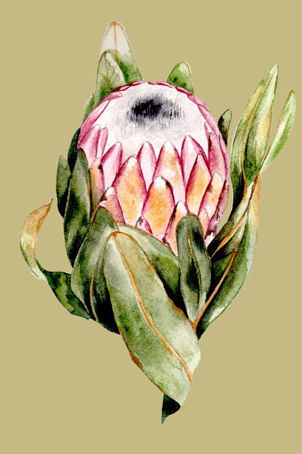
If you’re familiar with the protea plant you know that it is not a plant for the faint hearted. This is a dynamic, tropical plant that demands attention! I thrive in creating highly detailed watercolour artwork. I have to say that this was quite a challenge for me.
I’m Rubana, the designer and owner of Crimson Letters. If you’re looking for bespoke or custom illustrations or perhaps you have a special event coming up, get in touch at rubana@crimsonletters.com or get in touch here.

How did I set about finding design inspiration before the watercolour stage?
After some feedback from my client, I searched for as many images as I could that matched her description. She was particularly looking for pale pink, white and cream proteas. I filtered out the images and focused on the images that I thought would translate well in design terms and focused on the images that I felt would make a quality artistic composition. This is great website, that sells proteas and has a wonderful range of images.
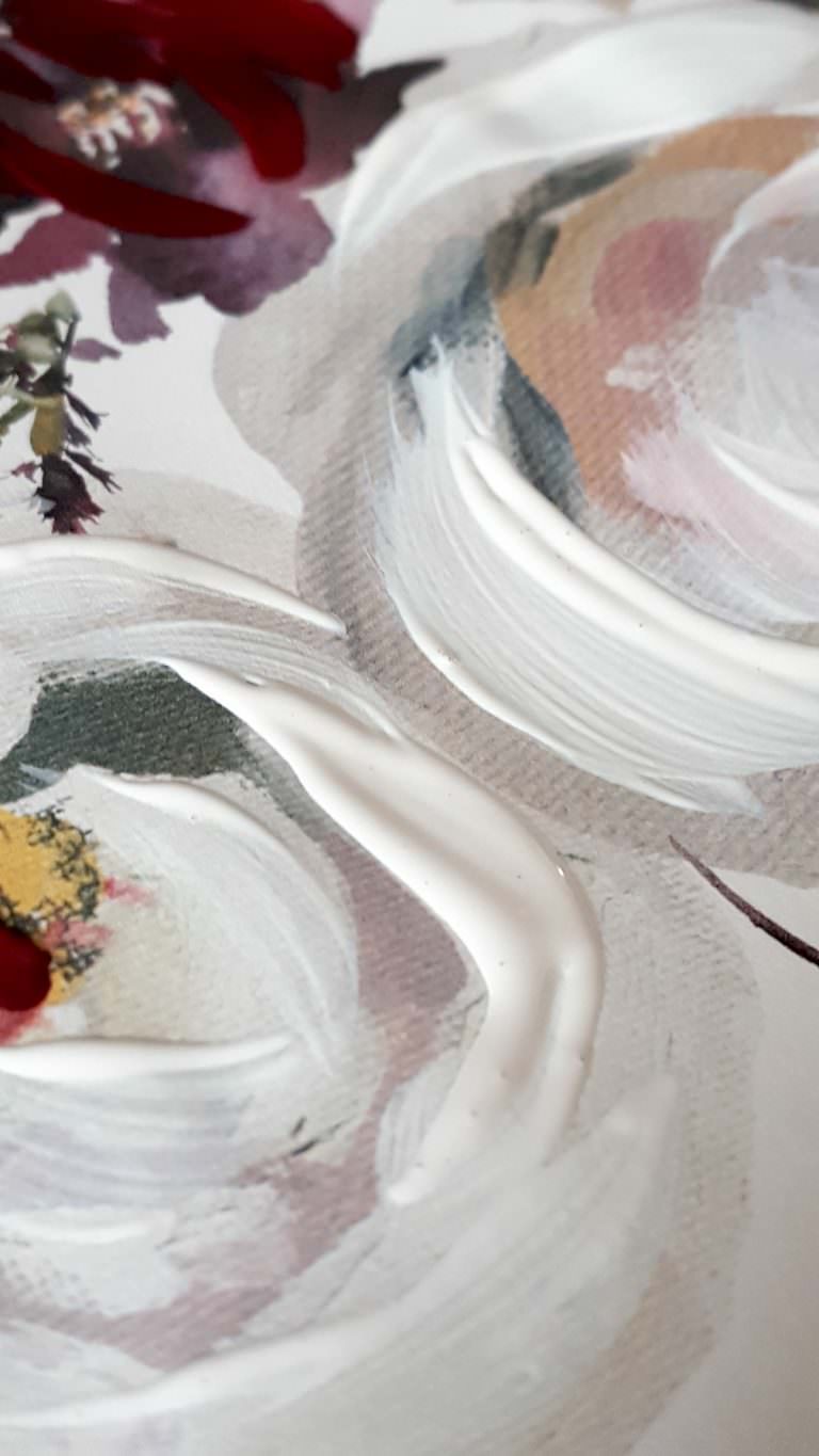
Watercolour artwork for protea watercolour wedding invitations
After I had selected some images, I roughly drew an outline of the protea. Creating a watercolour illustration on a small scale is much harder and quite tricky to get right. For me, I have found that focusing on a larger watercolour is much easier to handle and get right. I simply scan it in and reduce the size right down. This technique seems to work really well.
How long does it take to develop watercolour artwork?
Detailed watercolour is by no means easy or quick to produce. One highly detailed piece can take several sittings and many hours of work from start to finish. With the video below, you can see a quick example of how I build up layers of the centre area. You can see that there are many hours involved with building a beautiful design. It must be done slowly, step by step.
Does the brand of watercolour paint make a difference?
Poor watercolour paint quality will ultimately lead to a poor quality of work. I cannot emphasis this enough, but as soon as you can invest in purchasing high quality materials, make sure you invest! To create the artwork for these protea watercolour wedding invitations I sourced all of my watercolour paints from Jacksons Art store.
Daniel Smith is the best brand that I have had the pleasure to use. The colours are rich, bright and have a higher level of intensity. This is a brand that I have seen many other watercolour artist use and believe me, if you can only invest in a few key colours, it is very much worth it.
Which type of watercolour paper is the best?
Personally I prefer to use Archers, cold press watercolour paper. This brand is particularly rough and grabs onto the watercolour very well and I prefer to use this brand the most. Archers is an expensive brand when it comes to watercolour paper. After trying various other pads, this brand is the one that works best for my style.

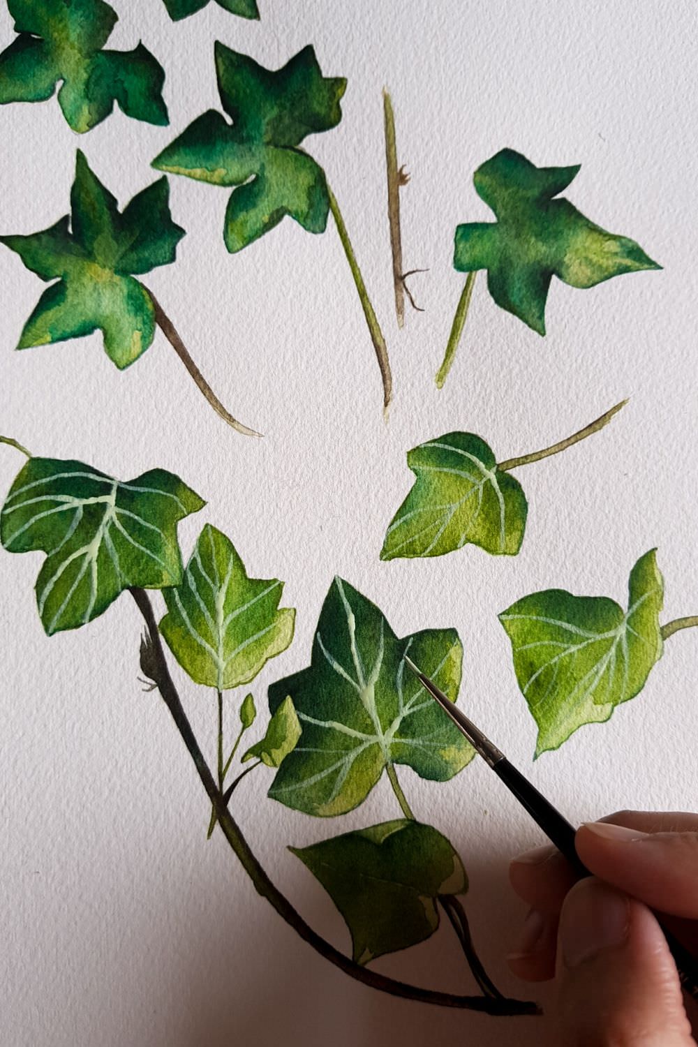
Protea watercolour wedding invitations – next came the leaves
After creating all the above floral watercolours it was time to move onto illustrating a range of foliage. I needed some leaves to help balance out the florals. The client requested ivy leaves. You can see the leaves in watercolour below. I created two separate sets of watercolours, both were highly detailed and quite rich in dark green emerald and sage green colour, finished off with thin white veins.
Once I had finalised all of the leaves and completed the below artwork, I then removed the background so that I could play around with the final layout with the above proteas.


Calligraphy for protea watercolour wedding invitations
Lastly it was time to create the calligraphy and compile some design variations to show my client. I went through many design iterations at this stage. I presented many variations of calligraphy and design layouts. Here is an example below of some of the final designs.
The calligraphy with the first design below has not been digitalised. The second invitation design, you can see the calligraphy has been digitalised to give a smoother finish for printing.


I do hope that you have enjoyed this blogpost. If you’re a stationery design or just a highly talented individual looking to create some beautiful illustrated custom invitations, perhaps this blogpost has inspired you with what’s possible with a little hard work and dedication.
If you’re looking for some custom wedding stationery do get in touch, or alternatively come over and say hello on my Instagram page or Pinterest profile. Pop over to my portfolio page where I share many more designs.
Other blogposts that you might be interested in:
Why choose illustrated wedding invitations?