The World of Watercolour Illustration:
Seduced by all things floral, I take my first steps into the watercolour illustration and I’d like to share my story behind this piece with you.
Through this blog post I will first of all share some of my ‘wedding invitation designer’ background and then share my step by step process and some behind the scenes of how I tackled an abstract and detailed watercolour illustration based on the same inspiration – the humble anemone flower.
Anyone who knows me and my style, knows that I don’t like to half do things, so this may be a whopper of a blogpost!


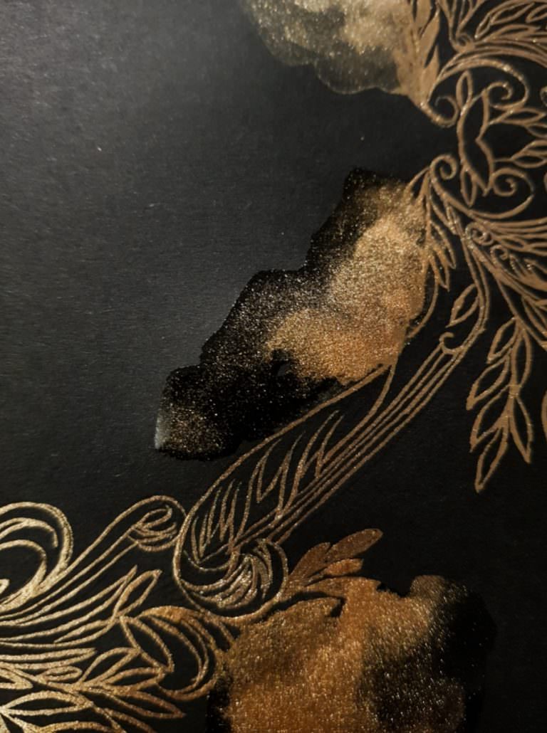
By the way, the above images are from prints that I used to sell on my Etsy shop.
First of all I thought that I would give you a bit of background and introduce you to who I am, what I’m about, where I hope to go with my evolving art style.
Passionately for the past 3 years, I have been developing my skills and honing my portfolio as a hand painted wedding invitation designer. After pushing this area very hard, and working constantly I have become quite frustrated – which in a way has been a huge blessing and led me to my current new path. Watercolour Illustration.
What led me to watercolour illustration?
Let me explain.
As a luxury wedding stationery designer, I recently listened to a podcast about a high profile calligrapher. I was pretty impressed to learn that she had worked for Saks Fifth Avenue and alongside other high profile figures and brands. I immediately looked up her website and guess what?
I was dismayed. I saw that her work was actually not all that. Her calligraphy was of quite a poor standard. I realised that I had the skill, but I do not have the contacts. After listening to other podcasts and learning that to be successful and get referred to clients I had to at least go to something like the Engage Summits. Not being a fan of huge outlandish parties with a bunch of strangers, I knew I had almost reached the point that I want to say goodbye to cosying up to wedding planners and a big hi and hello to the world of watercolour illustration.
I have really just about had enough of “fake commenting” for the sake of connecting on instagram to try and cosy up to the right planners. I HATE, HATE, HATE, being so superficial. I am so very thankful for all the wonderful friendships that I have forged with my followers and I always look forward catching up with them.
Yet, so many invitation designers go on and on about how all their clients come from instagram. Yes I do know I am going off on a big tangent here and am ranting a wee bit. Yet I hardly had any clients at all despite spending hours connecting via Instagram! These are just my thoughts and of course you may have whacked it out of the park and had a much better experience than me.

I know that it is high time to develop something else. It is certainly time to expand and develop a secondary income stream.
I now will be putting a lot of heart, my soul and passion into watercolour illustration and lean more toward working via an art agent, build my portfolio for a line of art prints, as well as reach out to work with commercial clients.
Watercolour Illustration for a New Direction
I recently came across two other watercolour artists, that transitioned from doing full time watercolour wedding invitations, to now only doing full time watercolour illustrations.
A spark went off in me.
More than anything else, more than spending a whole month on the production of 700 pieces of hand painted wedding stationery, I actually am completely head over heals in love with creating ONE EXCEPTIONAL PIECE of artwork.
For a long time I have loved many florals ad am often inspired by many floral stylists such as Sarah Winward, Ponderosa and Thyme and Cristin Francis. but right now I have particular love for anemones, so I decided to use that as my starting point. I found the below photograph via Pinterest and decided to use that as my inspiration.
First step in Watercolour Illustration – Find a Point of Inspiration

Before I dive in and show you the various watercolour stages here are some of the materials and equipment that I used.
Watercolour and Art Materials:
Watercolour paper
Paintbrushes
Mechanical pencil & eraser
Watercolours
Watercolour Paper:
My most preferred watercolour paper for watercolour illustration. This paper is a new favourite. I only recently discovered it. It is quite grainy and has a very rough texture.
You can choose between hot or cold pressed watercolour paper. I always use cold pressed. I don’t know if other illustrators like this or prefer a smoother paper. Personally, I love its texture and highly recommend it. Here it is Arches Watercolour paper.

Paintbrushes / Mechanical Pencil & Eraser:
You will need a mixture of large and small brushes for your watercolour illustration, which is what I used. These are the paintbrushes that I used to create my first, looser abstract artwork. As you can see all the paintbrushes have fine points which I really enjoy using. You need to buy sable brushes which are especially made for watercolour illustration, they’re really good at holding water.
I highly recommend using a mechanical pencil in a 0.35. It is so much easier to create detailed outlines to prep an artwork piece with fine lines, which disappear under the watercolour entirely.
Here is a link for paintbrushes and mechanical pencil should you need it.

Watercolours:
The paint palette that you see below by Sennelier which you can see here, is the one that I am most used to painting with. I also mix these paints alongside Windsor & Newton individual tubes of paint and I find that the combination of both helps me to create the colour balance I am looking for.
I do find that the tubes of paint give a more vibrant burst of colour, yet to travel with I find it really convenient to just throw my black Sennelier set into my bag and off I go.
Make sure you have two water jars on the ready as you start. I like to use one for the darker colours and the other for the lighter hues. Also I like to keep a tissue on hand so that I can wipe away access paint or any spills along the way.


Stages of my watercolour illustration
Ok, let me take you through the various sketching and stages of watercolour.
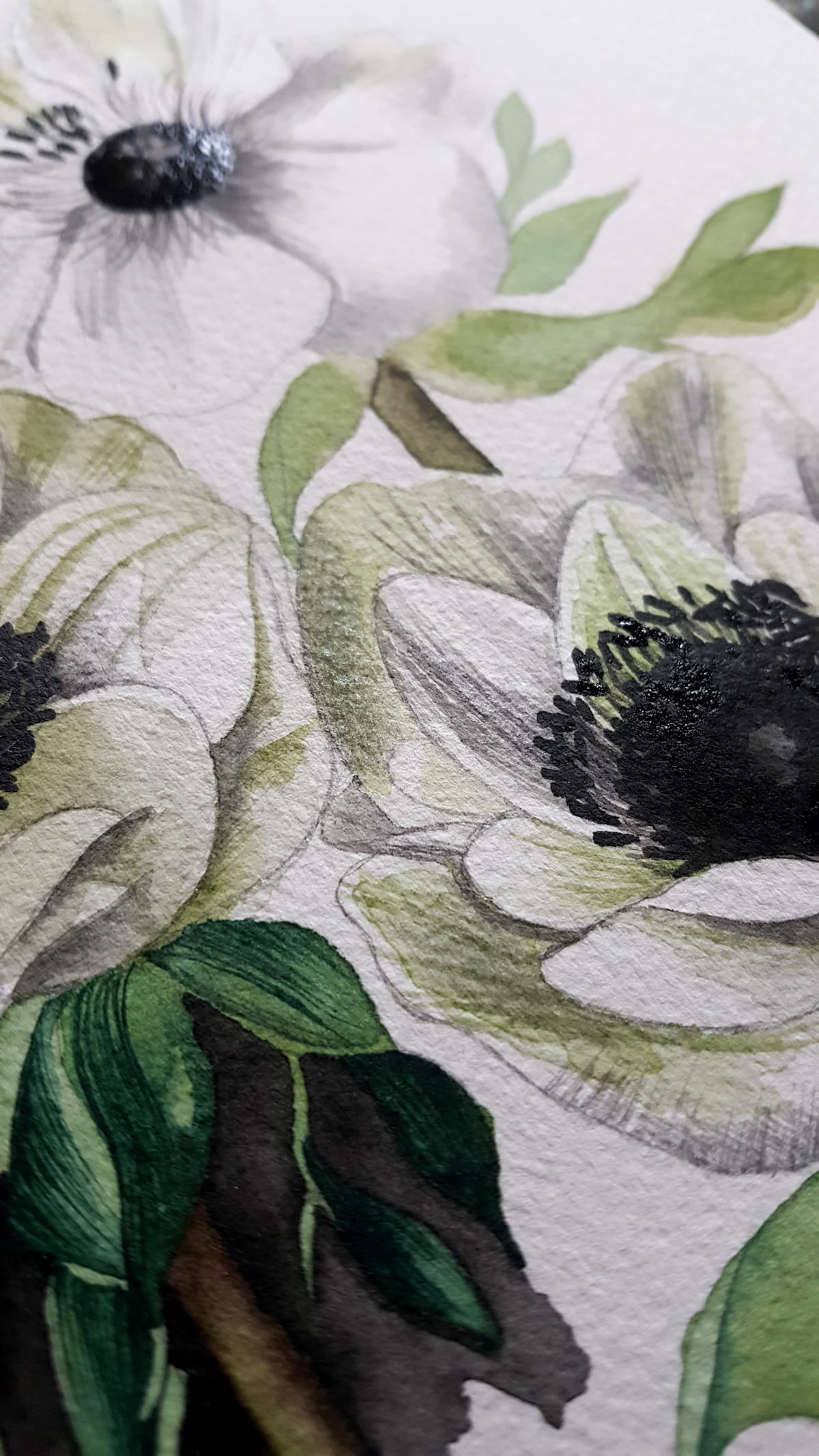
Going back to the inspiration ( if you remember the image from above) I set to work with my artistic translation of the image. It was a bit of an unusual way of working with this illustration, as below you can see that I went ahead and completed one flower. But it is interesting to see the beginning stages alongside the end result.
To start with you can outline the basic form and shape of the petals, the stems. Following on I work out the where the placement of the leaves will lie. If you look back at the photograph of the anemones, this is not an exact copy but I did use the leaves shapes to create my own version.
After sketching in the first phase, you can go ahead and watercolour the lighter tones. I used sap green and a pale green to work in some of the shadows.


You really don’t need to worry about those pencil lines being seen. The won’t spoil your watercolour illustration. Just make sure they are really lightly drawn. My lines are quite fine and are not seen at all after I have finished painting, so that is not something you need to worry about.
Adding Layers of Watercolour
As you can see from the below image, I add the same base shades to the above flower and go in and add more layers and a few details onto the below ( right) flower. Also I start to add the first base layer of paint to the leaves, to start to build up some depth and richness of colour. I have started to add some lines of watercolour going out from the centre of the flower to the outside of the petal.

At this stage it is worth mentioning that for highly detailed work it’s good to switch to some smaller finer brushes. The ones below are great for this type of work.
I particularly love the long thin brush on the left for the leaves ( you can see a demo in the video below). The brush on the right is the one that I use for all of the black flower centres.

Here are the sizes that I recommend.

Painting Final Details
Following on, I add all the base sap green colour with hints of darker green onto all of the leaves and paint over some of the stems for darker areas. Using the long bristle brush I go into the centre of the flowers and paint lots of fine hairlines to prepare the centres for all of the darker ‘seeds’ and black centres.
When I paint these smaller fine seeds, each stroke should be directional, that means they should all go towards a certain direction and flow together.


You can see from the images below that I have also started to add some more texture by drawing upon the petals with my mechanical pencil.

Painting Leaves
Adding dimension with varying techniques is something that I love to do. It separates my watercolour illustrations from being a boring plain one dimensional design and adds interest and a richness. Again I am a maximalist, not a minimalist!
Here’s a pro tip that I use:
If you only add a very small amount of water when you touch the paint you can then make very, very fine lines. Using the tip of the brush as long as you sweep it across with attention. Focus hard!
I have added a little video that demos the technique that I use. You can practise these fine lines. Use a separate piece of paper to warm up. Keep practising to develop confidence before you continue on. Apply this tip to your final piece.
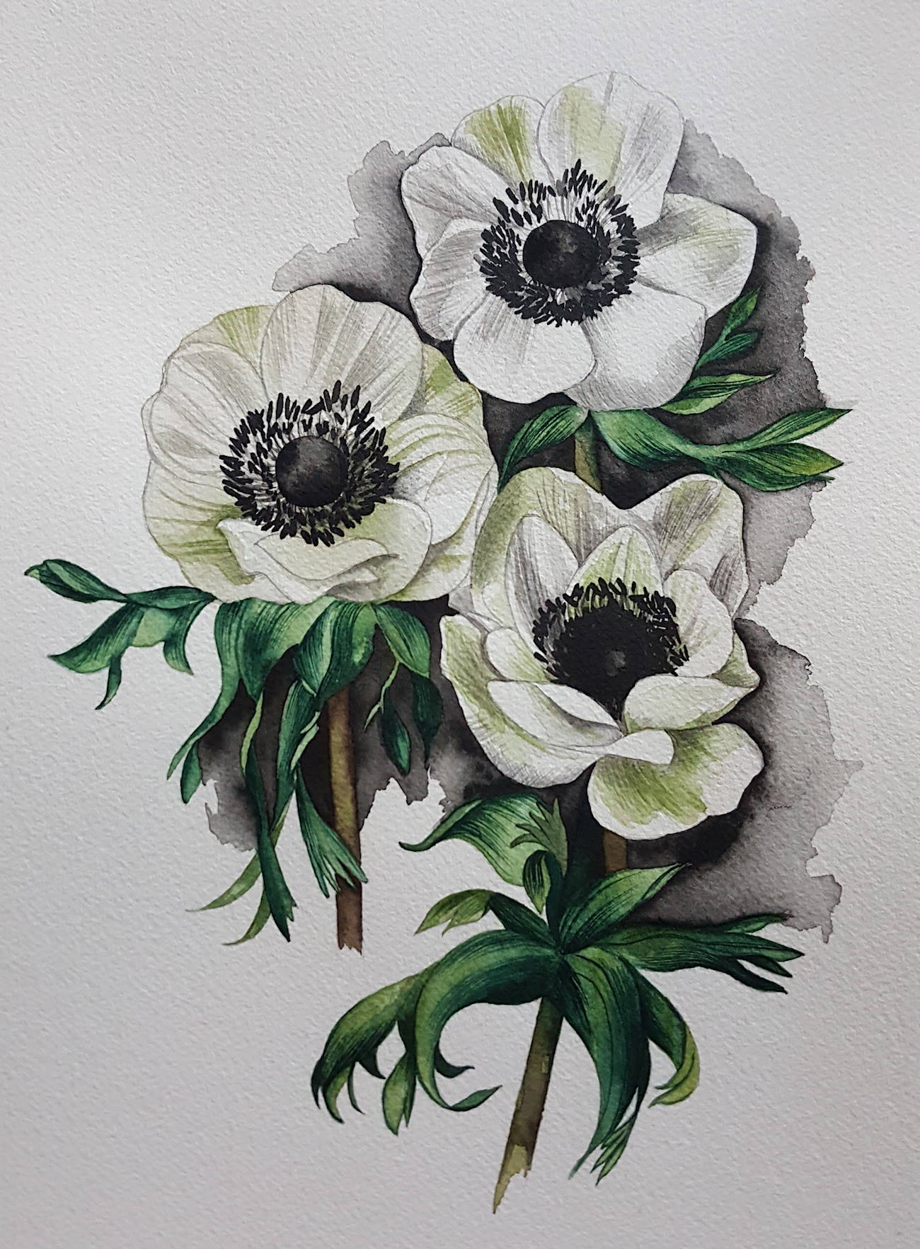
By using the technique in the video above I add as many details and little green lines as I can. Finishing off I added some more pencil lines and shading around the petals here and there. For extra contrast I painted some black hues around the watercolour illustration to give it that hint of drama.
For me I find that really lifts the illustration off the page.
I hope you enjoyed this little, tutorial / technique sharing / peak behind the scenes! I know this blogpost was a little long winded. If you have managed to make it to the end of this, WELL DONE!!
What do you think? How about trying to paint your own watercolour illustration? Comment and let me know how it went.
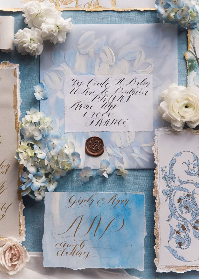
If you liked this article, you may also enjoy looking behind the scenes at how I tackle the design process for wedding stationery.
Perhaps you’d enjoy reading how I designed some bespoke wedding stationery here or my creative escort cards and place names.
If you’d like to look around my portfolio see here.
If you’d like to contact me for more information get in touch here.
Or drop me a line at rubana@crimsonletters.com