Navy Blue and Gold Custom Invitations – with Accents of Magenta, Burgundy & Plum for a Wedding at Le Meurice, Paris, France
Last November 2020 I had the pleasure of designing some blue and gold, luxury hand made wedding save the dates that you can see here for a wedding at Le Meurice, Paris. As a follow on I have designed this same client’s custom navy blue and gold custom invitations.
Consistency in design
It was important for my client to have a follow on in terms of design consistency from the save the dates that I previously designed. With her save the dates as it was a much smaller collection of 25 suites of – a save the date card and one envelope with a watercolour artwork envelope liner, it was much more feasible and viable to completely hand make and only use hand calligraphy throughout the entire suite.
It was very important to my client to have as many elements of her stationery suite hand made. In this case, with a smaller amount of invitations, it was quite possible to handle.
However with the main wedding stationery suite for her wedding there are many more pieces or card inserts to be designed so it will not be possible to use original hand calligraphy throughout the entire suite. There will be an invitation card, information card, rsvp, reception card, ceremony card, invitation envelope and rsvp envelope. Altogether that makes a total of seven elements that need to be individually designed.
Using the same colours
It was important to the couple to use the same colours, yet they wanted to see a change and perhaps introduce a darker green colour. I mentioned more of a use of burgundy and magenta that could be used as focal points throughout the card and to use ink colours of magenta and deep plum to pull through and create more contrast and depth within their wedding stationery design.
Here below you can see the navy blue and gold custom invitations that I designed.


Crest Designs
To add extra flair and style to this navy blue and gold custom invitations suite and to offer my client a few variations, I created a series of 4 smaller crest designs that you can see in the top two photographs. Some crest designs had a CD, solid monogram letter shape and on the other crests I had calligraphy letters as a point of difference. It’s important to me to offer my custom design clients a range of design so that they can see what’s possible. Design is a very collaborative process and only with the client’s feedback we move together to the next step.

Floral Watercolour
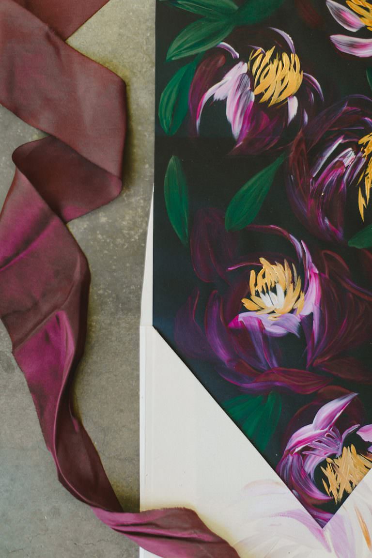
I could have easily used the watercolour floral painting for the last save the date collection, yet I wanted to offer the client some fresh and dynamic red rose and calla lily watercolour paintings. So above you can see that I created an entirely new set of watercolour painting illustrations. I hand painted a total of three detailed rose watercolour paintings as well as some calla lilies watercolour paintings.
Once completed, I scanned this artwork in, removed the background and set about creating a composition for the envelope liner. You can see the watercolour illustration (above) that I used for the final suite below.
I wanted to keep another accent of this floral composition within the suite, therefore I used the rsvp envelope as a way to echo the same design through this navy blue and gold custom invitations suite. I focused predominantly on using as much navy blue card stock throughout this wedding stationery collection as possible.


All of the black text was used merely as an example. The black text would be converted into gold foil printing for better visibility.
Rebranding or creating a sequel is never easy
One of the most hardest things as a creative designer is to follow a set of designs or “rebrand” as it were, or to create a beautiful sequel, that follows on from the first set of designs or collection but also out performs it or shall we say exceeds all expectations.
Insights & client feedback
Once I had sent the above first design cycle / collection that I had created, the client gave me her feedback.
Slide or page 5 of the presentation, where every piece is shown, I really like how everything looks but I feel like it’s missing something. Maybe I feel that way because all the pieces are heavy card stock.
I know you mentioned something about a piece of vellum and I’m thinking now that you might be right in that suggestion.
I’m looking for something with a different texture to break up the heaviness and add some oomph to the wedding suite. Do you know what I mean? What are your thoughts or suggestions on this?
And to throw a complete monkey wrench into this whole process, I have fallen completely in love with the design of your Portuguese Panache suite.
How incredibly difficult would it be to create an RSVP and wedding card like that? I love the 2 different papers with the watercolour background against the gold crest and black calligraphy. I feel like it completely changes everything. Please know this is just a random thought I had and realise it might be impossible to change direction now. Please do not hesitate to say so. OR maybe there is a way to combine both styles into a cohesive vision?? This is where I look to you for complete guidance, as your artistry and visionary work are simply exquisite!!
Based on the client’s feedback we went straight back to the drawing board and reassessed the entire wedding stationery collection. Some key take aways from my client’s feedback where the following:
- Break up the heaviness and create lighter pieces using vellum
- Add a new creative direction and add a few new colours / hues and lighter accents
- Integrate a new RSVP card design
I immediately sourced some vellum paper that was specifically used for printing and ordered white and a medium caramel colour for a printed piece to add more depth and variation to the suite. Also I wanted to make sure that I added an air of lightness by adding in subtle pieces of vellum.
Artistic wedding stationery using calligraphy & vellum
Here below are some of the elegant, light and airy vellum pieces that I developed to add an ethereal touch to this otherwise heavy collection of navy blue and gold custom invitations. My client was very particular about using as many hand painted applications and as much original hand calligraphy as possible.
Therefore all of the below white vellum invitation pieces are all hand made original hand calligraphy for a high end, luxury wedding invitation suite.


Elegant vellum wedding invitations
Alongside using the above white vellum pieces, I also used a soft caramel / beige shade vellum to translate the rsvp envelope design from a stronger design to a light, more delicate envelope design. I used the same watercolour floral illustrations for the envelope liner and addressed all the rsvp envelopes with hand calligraphy.
After I hand addressed all of the envelopes, I continued on to assemble and wax seal every envelope with some hot, deep magenta wax. What I didn’t realise during the assembly process, is that wax does not stick well at all to vellum!!! Vellum is actually wax proof and you can easily peel the wax right off vellum. To my horror all of the wax seals had to be applied again. The solution was easy. Some double sided tape!

Here are a few sneak peaks of the final custom made vellum envelopes.

Wedding invitation card wraps
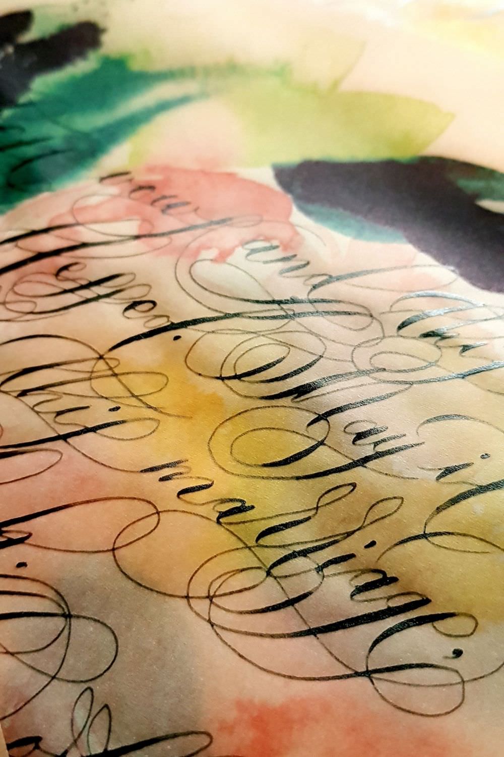
Continuing on, in order to echo the lightness and beauty of the vellum, I continued to use it for another piece within the stationery suite. To hold the wedding invitations together in an elegant way I designed a vellum wedding invitation card wrap. This time, as a printed base design the client had chosen a new fresh design that she saw from one of my editorials and decided to use (this collection here) as a new source of inspiration. I used the abstract loose floral watercolour painting and printed it on the vellum, before adding a some “editorial” wild calligraphy that would have more of a decorative function to add to the overall uniqueness of the stationery suite.
Here is the poem that my client chose to have in black calligraphy upon some vellum for her wedding invitation card wraps.
This Marriage
May these vows and this marriage be blessed.
May it be sweet milk,
this marriage, like wine and halvah.
May this marriage offer fruit and shade
like the date palm.
May this marriage be full of laughter,
our every day a day in paradise.
May this marriage be a sign of compassion,
a seal of happiness here and hereafter.
May this marriage have a fair face and a good name,
an omen as welcomes the moon in a clear blue sky.
I am out of words to describe
how spirit mingles in this marriage. – RUMI

White and gold wedding invitations
Following on from the new stationery pieces above here are the other changes that the client requested for her navy blue and gold custom invitations. She liked the appearance of the Portuguese Panache – Portugal themed wedding invitations. The client was really profoundly drawn to the main gold crest design on the large love-letter style invitation card. She also voiced her preference to have hand calligraphy for her and her husband to be’s names in calligraphy, rather than original calligraphy.
After a few design iterations here is the new invitation card design below that I handmade a real physical copy with my calligraphy dip pen and gold calligraphy ink, so that my client could get more of a realistic idea of what how the final piece will appear, rather than a digital copy.
https://www.pinterest.co.uk/pin/358176976622500963/

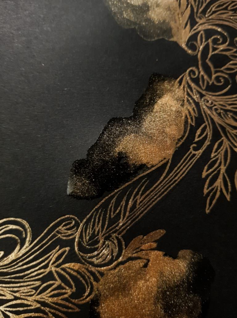
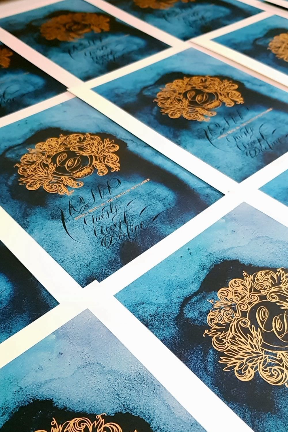
Gold foil wedding invitations
The client loved the above changes and so I continued to convert the above crest design to a gold foil design that would be professionally printed as it would have been far too much work and rather expensive for my client for me to make all of these by hand! I decided to keep all of the wording in black calligraphy and leave some room for the couples’s names to be hand written in calligraphy. It was quite tricky to squeeze these names into such a tight space, but I managed.
Once I had the final gold foiled wedding invitations through, I knew that the design itself still needed a little oomph. It needed a little touch of extra gold detailing. So I decided to add a few special hand painted touches in some certain areas around the crest design to emphasis the crest design more and add more depth and texture.
With the video below you can see the first few minutes of real time painting and the amount of time it takes before viewing the time lapse video.
https://www.pinterest.co.uk/pin/358176976622630070/
Below you can see some further sneak peaks from the production of these gold foil wedding invitations and a few images with the hand torn and hand painted edges.


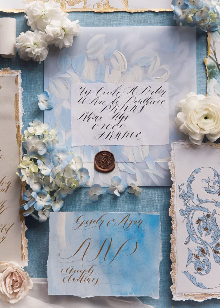
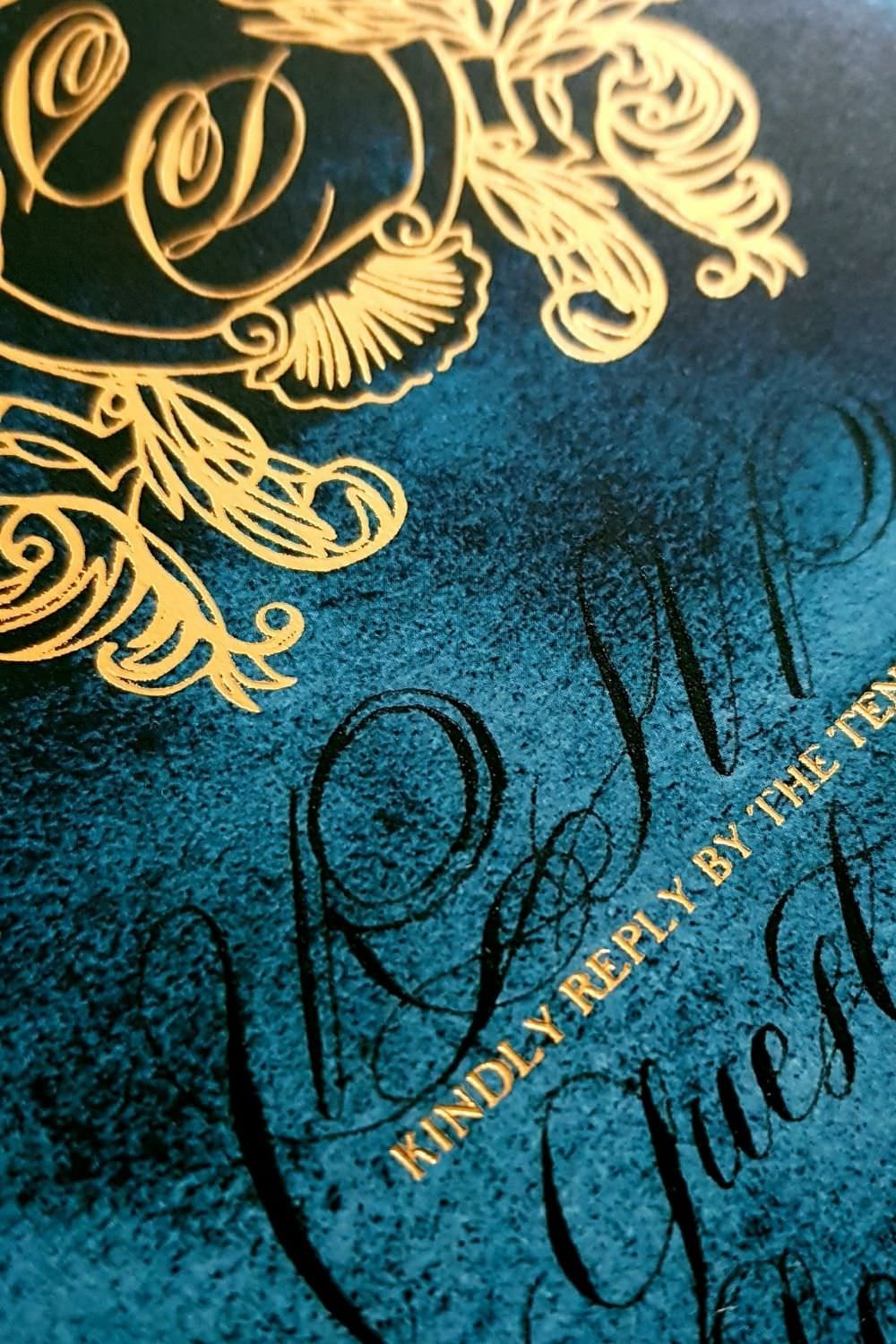
Revised rsvp acceptance card design
Following on from the invitations above, the client wanted me to completely change and revise the rsvp card design. She opted for a deep blue watercolour background with black calligraphy and a gold crest design made in gold foil printing. All the edges would be hand ripped and the card itself mounted upon another pieced of navy blue card stock so that the rsvp card design would appear slightly heavier and more weighty.
Here below are some images showing the process of calligraphy and design throughout various stages of production.

The final cut – bespoke wedding stationery design
The last part was to hand tear any last edges, very delicately add gold foil leaf and add all of the vellum wraps and finally wax seal all of the envelopes – this was a process that took three days before I was finally ready to start packaging.
Here are the final images of these rather elegant Navy blue and gold custom invitations.


I hope that you have enjoyed this rather long blogpost. Creating a suite of highly customised, bespoke wedding stationery is a highly intensive and rewarding process that requires lots of back and forth communication and design revisions. It is not always this way. Sometimes clients are very, very well informed and they have done their homework. They know exactly what they would like to use for visual inspiration and have a much clearer vision of what they would like to have designed and therefore their vision is much, much easier to achieve.
If you have a special custom stationery design project, reach out and get in touch. I love working with a whole host of clients that require custom designed stationery. Send me an email via rubana@crimsonletters.com, get in touch and let me know your thoughts.
Here are some links to other suites that I have designed for past clients:
Visit my shop and buy your own original artwork, or a print for your home.