Acrylic Paintings: Passion Project
Inspired by the paintings of Burne Jones, I set about to create my own version of a deep, dark yet rich acrylic painting. I’d like to share how this passion project came about and how I created the abstract acrylic paintings.

Where did I start to gather inspiration for this acrylic painting illustration and what sparked my creativity?

Ok, this is a long story, so bare with me here as I go off on one of my tangents!
As a wedding invitation designer, for anyone that doesn’t know me I create hand painted wedding invitations, I often like to work on editorials to push my creativity and give me a portfolio with an edge.
As one of my last style shoot / editorial collaborations this year, I teamed up with the dreamy dress designer Joanne Fleming. Joanne is not one to follow mass, mainstream trends but when you see her work and her dresses you get that she is a major trendsetter. She does NOT shy away from making a statement and I so love that about her.
What really caught my attention about her was the fact that she can do very light ethereal-romantic or very dark-dramatic creations.
I find that we are very similar in that way. I love the dark and mysterious, almost fantasy vibe but then I love the light and airy too.
For some context I have added some images below to show you the type of high end, editorial style that Joanne is all about. I remember coming across her work a very long time ago, at the start of my creative journey and then went on to completely forget about her as I worked on other style shoot collaborations around the world, in Russia, Italy, America and Portugal to name a few! I had never thought of working with a creative in England (my home).


So, on with the acrylic painting story-
After working on an intensive 2 month project using very pale and light hues, painting watercolours of white colours and having my art direction very limited, scrutinised and closely controlled (I mean even a 2 mm space here and there had to be accommodated – don’t ask) I took a huge sigh of relief. Joanne approached me when I really needed it!
Joanne wanted to create an editorial based on a Burne Jones / Briar Rose Pre Raphealite theme that was like a very early sleeping beauty fantasy concept.
She requested some very dark, dramatic rich designs focusing on black, deep aubergine/claret, burnt orange, reds and gold. It was a dream come true for me! She gave me complete creative freedom and allowed me pretty much to do anything I wanted based on the inspiration she provided via a private Pinterest moodboard.
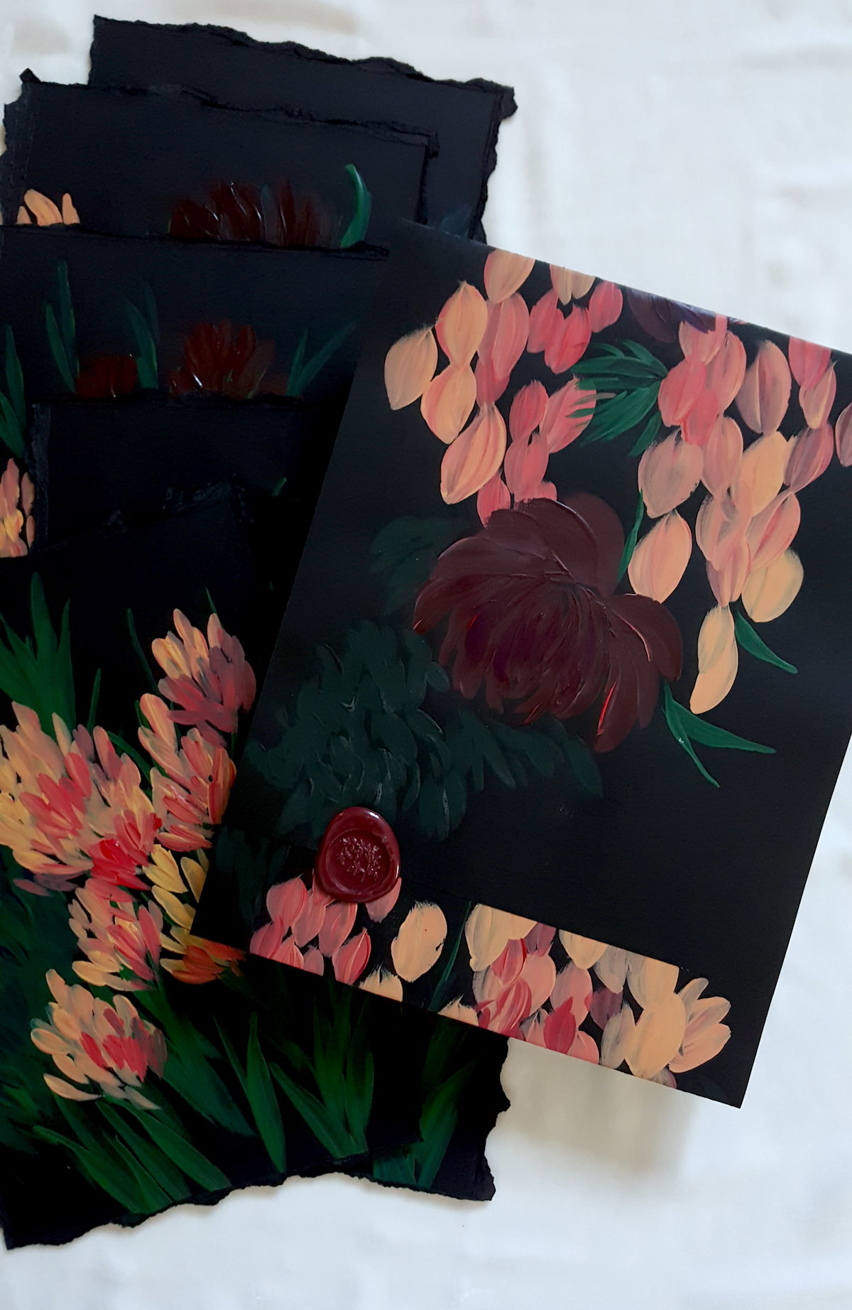
Using the above painting (right at the top) as my main reference point and letting my heart guide me I took out my black paper and started work. I used the foliage from the leafy border at the bottom and added lots of foliage as a background base on each of the acrylic paintings.
I needed to create a series of 6 abstract floral acrylic paintings for menu covers.


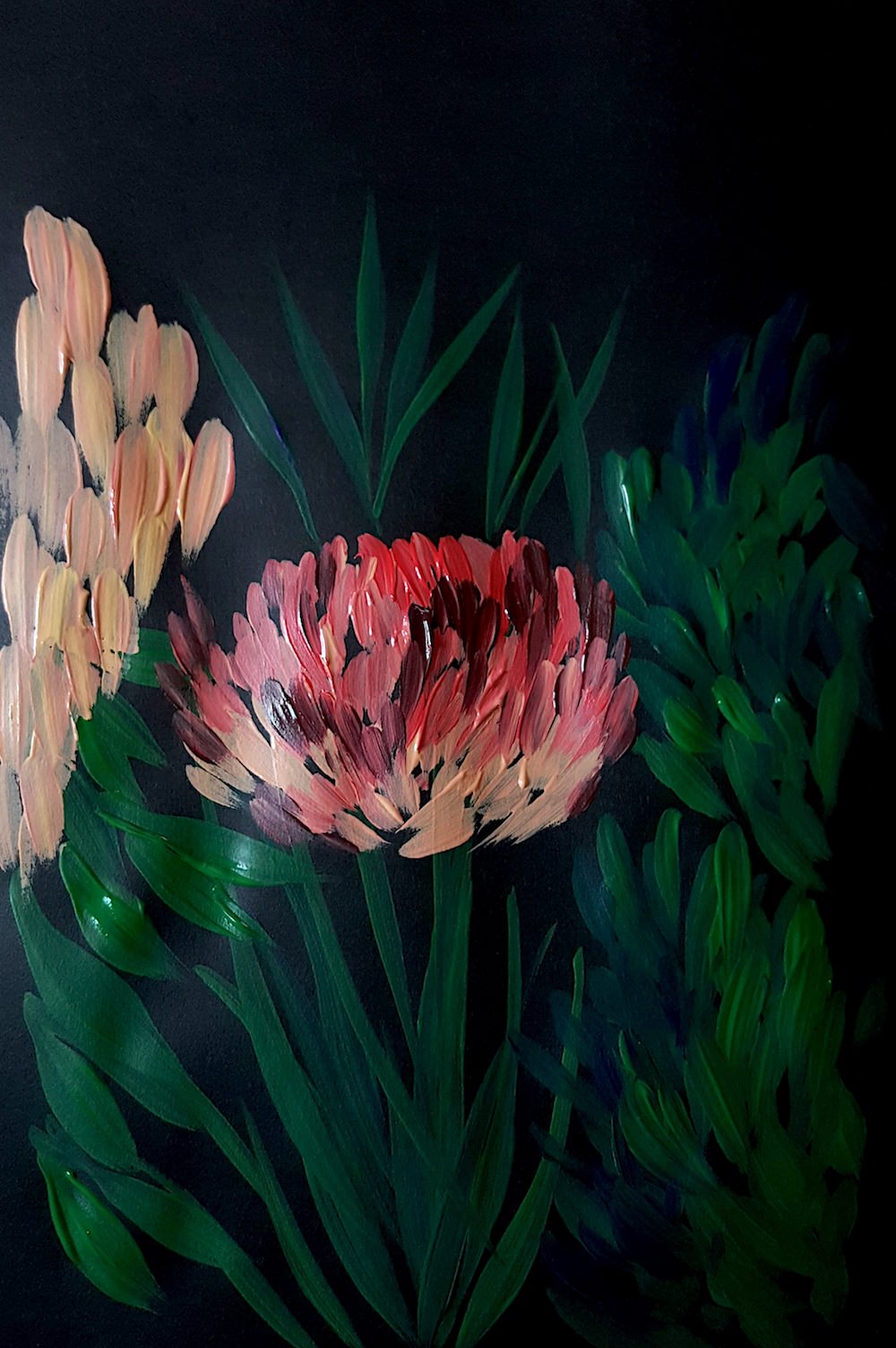
I made sure that each of the abstract floral paintings were quite different from each other, yet all keeping within the same theme and colours.
https://www.youtube.com/watch?v=-TiFgDNQ1CQ


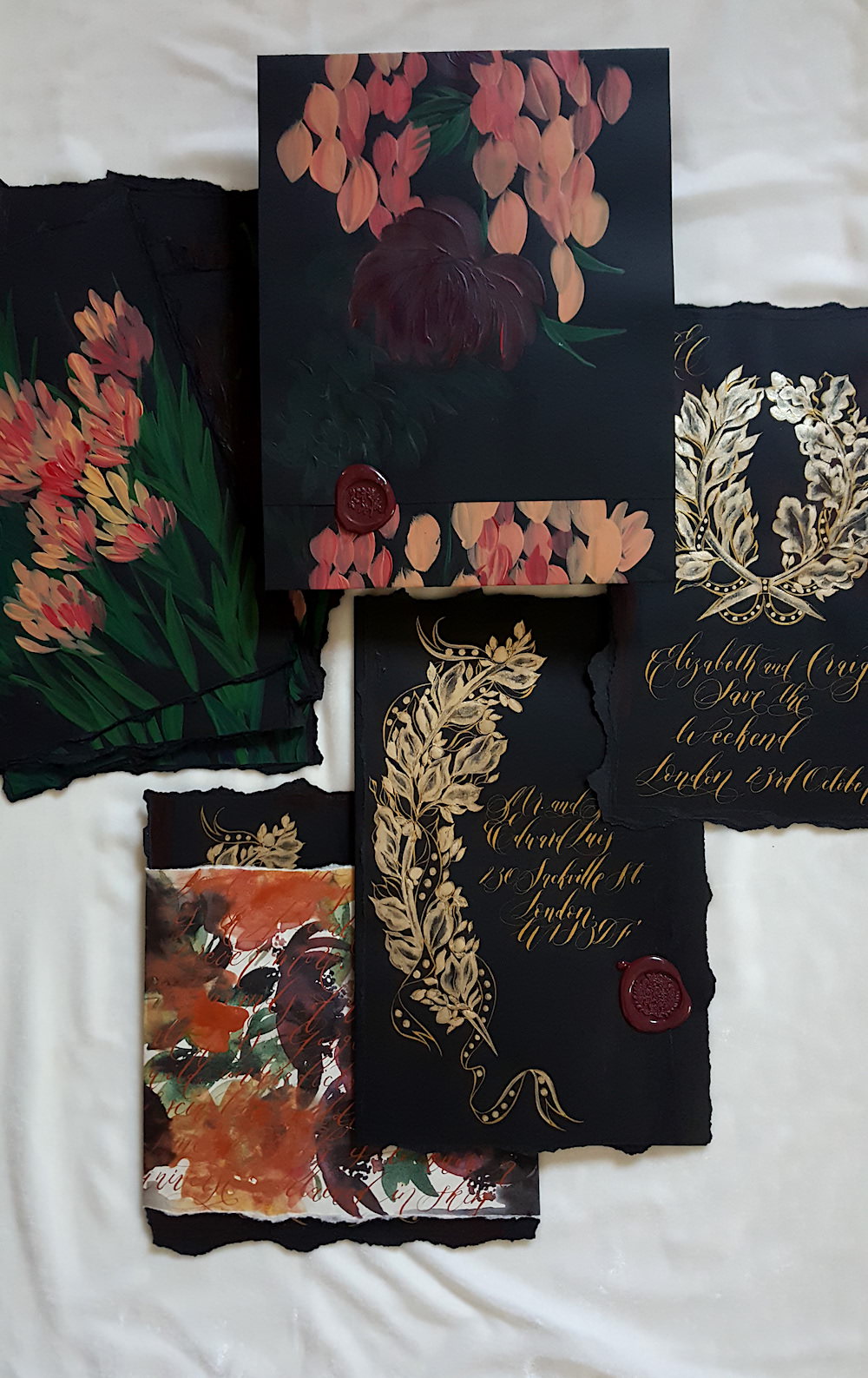
I also made a hand painted, hand made envelope with a merlot wax seal to add more texture.
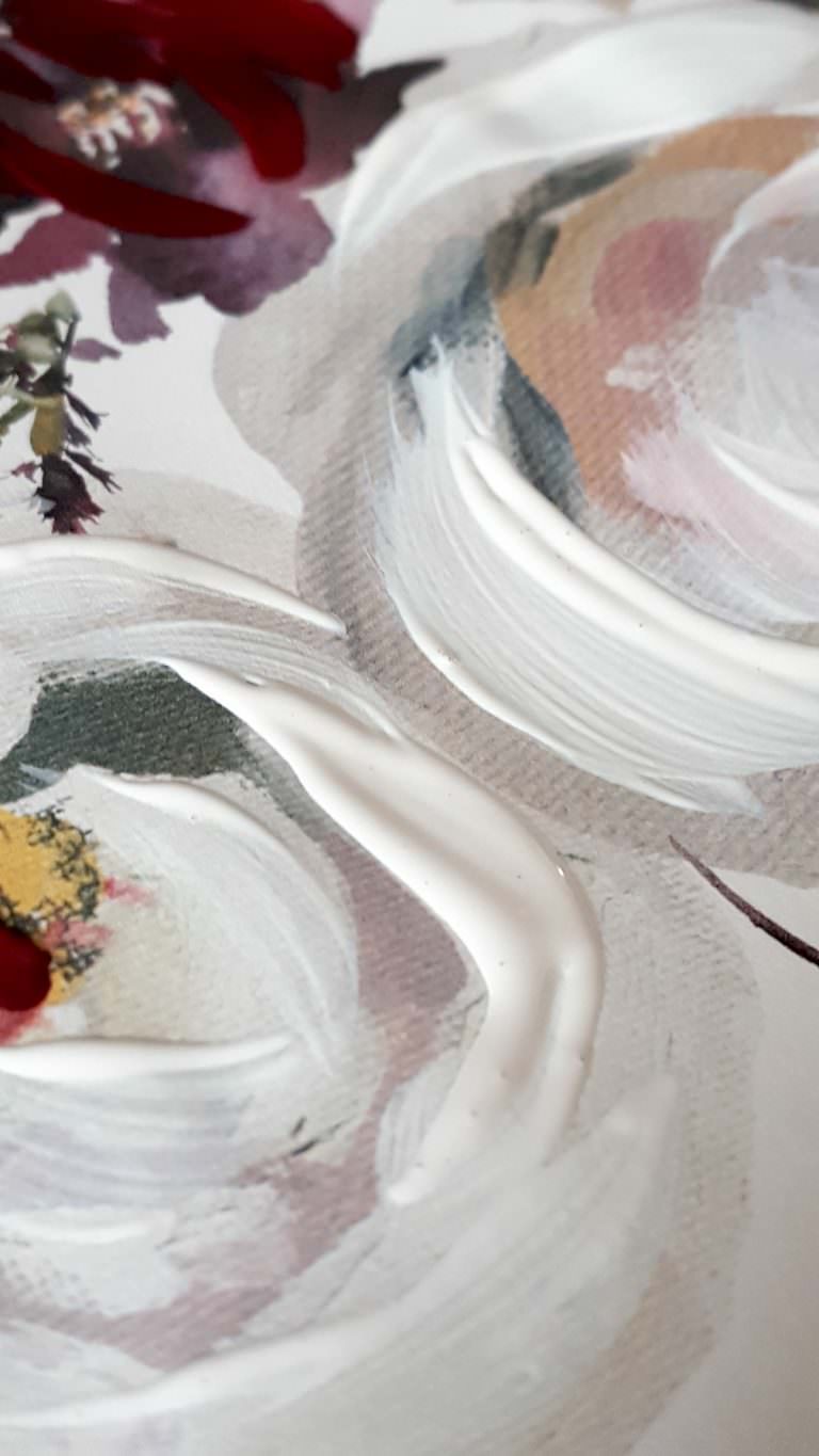
The materials that I used for the acrylic paintings are pretty simple.
I source all of my paper and for this instance I painted directly onto black paper from GFSmith in London. To finish off the menus and make sure that they were not all crinkled, I dried them, pressed them lightly in a book. Finally I mounted them on strong black card with torn edges.
Here below is some of the hand painted wedding stationery that I produced alongside the acrylic paintings.
If you’d like to view the full collection that I created, have a look here at this Black Tie Invitation Suite.
Leave a comment below and tell me what you think!
Perhaps you would like to try your own set of acrylic paintings?
If you’d like to see some more of my designs visit my Portfolio here.
I also work on custom hand painted designs.